Our Complete Guide To Landing Pages That Convert
Landing pages are one of those things that many businesses spend considerable time and money driving traffic to, only to find that the traffic simply does not convert into leads, sales or enquiries. I...

Landing pages are one of those things that many businesses spend considerable time and money driving traffic to, only to find that the traffic simply does not convert into leads, sales or enquiries. It is a frustrating situation that is more common than most people would care to admit, and in many cases, the root cause is not the traffic source itself but the landing page that the visitor arrives on. Getting this right is not about following a rigid formula or slapping a button on a page and hoping for the best. It is about understanding what your visitor needs to see, feel and believe before they take action, and then delivering that experience in a clear, compelling and trustworthy way. This complete guide to landing pages that convert is designed to walk you through every key element that separates a page that performs from one that quietly bleeds your marketing budget.
What Actually Makes A Landing Page Convert
Before diving into the individual components, it is worth taking a step back and thinking about what conversion actually means in this context. A landing page that converts is one that takes a visitor who arrives with a level of intent and moves them, confidently and without friction, towards completing a specific action. That action might be filling in a form, making a purchase, booking a call or signing up to a list. Whatever the goal, the page needs to be laser focused on that single outcome. One of the most common mistakes made with landing pages is trying to do too much. Navigation menus that lead people away, multiple calls to action pointing in different directions, content that tries to cover every possible audience segment at once. All of these create confusion, and confused visitors do not convert.
A well-constructed landing page respects the journey the visitor has already taken to arrive there. If someone has clicked a paid social ad promising a free consultation, your landing page needs to fulfil that promise immediately and make the path to claiming it obvious. Mismatches between the ad or email and the landing page are one of the most damaging things you can do to your conversion rate, and yet it happens constantly.
The Headline Is Everything
Your headline is the first thing a visitor reads and in many cases it is the deciding factor in whether they stay or leave. It needs to communicate, clearly and immediately, what the page is about and what the visitor stands to gain. A vague or clever headline that sacrifices clarity for creativity will almost always underperform. Think about what your visitor is hoping to find when they land on your page and lead with that.
A strong headline speaks directly to the visitor's situation or desire. It does not try to impress with jargon or industry buzzwords. It simply connects. Supporting this with a concise subheadline that expands on the main message gives visitors a little more context to confirm they are in the right place before they scroll further down the page.
Tools like Unbounce and Optimizely are widely used by digital marketers to test headline variations and understand which messaging resonates most with a given audience. Testing is not optional if you are serious about improving your results.
Understanding Your Audience Before You Write A Single Word
Landing pages that convert are not written in a vacuum. They are written with a very specific person in mind. Before you touch a headline, a bullet point or a call to action, you need to be clear about who is arriving on the page, what they already know about your offer, what objections they might have and what outcome they are hoping to achieve. This level of audience understanding shapes every decision you make, from the tone of the copy to the imagery you choose to the length of the form you ask them to complete.
Want more insights like this?
Join thousands of marketers getting weekly tips and strategies.
If your landing page is receiving traffic from a cold audience, perhaps people who have seen a social media ad for the first time, then you need to do more work building trust and explaining the value of your offer. If the traffic is warm, perhaps from a retargeting campaign or an email list, then you can afford to be more direct because the groundwork has already been done. The same landing page should not necessarily serve both of these audiences. Tailoring your page to the temperature of your traffic is one of the most overlooked aspects of landing page strategy.
Copy That Earns The Click
The body copy of your landing page needs to do several jobs at once. It needs to build on the promise made in the headline, address the visitor's key concerns, demonstrate the value of what you are offering and build enough trust that taking action feels like the logical next step rather than a risk. This is a lot to ask of a few paragraphs, which is why landing page copywriting is a genuine craft.
Benefits should always take priority over features. People are not interested in what something is as much as they are interested in what it does for them. Explaining that your software has a drag-and-drop editor is a feature. Explaining that it saves your team hours of manual work every week is a benefit. Frame everything through the lens of the visitor's experience and the outcomes they care about.
Keep the language clear and direct. Long, complicated sentences that meander around a point are not going to hold the attention of someone who arrived from a social media feed where they were scrolling past dozens of other distractions. Say what you need to say and move on.
Trust Signals And Social Proof
One of the most powerful things you can include on a landing page that converts is evidence that other people have trusted you and benefited from doing so. Testimonials, client logos, accreditations, press mentions and review scores all serve to reduce the perceived risk of taking action. When a visitor is on the fence, a genuine and specific testimonial from someone in a similar situation to their own can be the thing that tips the balance.
Generic praise is far less effective than specific, detailed social proof. A testimonial that says a service was great does very little. One that describes a specific problem, the experience of working with the business and the outcome achieved is far more credible and far more persuasive. If you have the option to include the name, job title and company of the person providing the testimonial, do it. Faceless quotes are less convincing than ones that come from a real, identifiable person.
Platforms like Trustpilot and Google Business Profile reviews can also be referenced or embedded to add a further layer of third-party credibility to your page.
The Form And The Call To Action
Your call to action is the point at which everything either comes together or falls apart. The button, the form, the instruction you give the visitor about what to do next; all of these need to be handled with care. Too many fields on a form creates friction and will reduce completions. Ask only for what you genuinely need at this stage of the relationship. If a name and email address is enough to get the conversation started, do not ask for a phone number, a company size and a budget range.
The wording on your call to action button matters more than most people think. Generic phrases like Submit or Click Here tell the visitor nothing about what they are going to get. More specific, outcome-focused language such as Get My Free Proposal or Book My Strategy Call performs considerably better because it reinforces the value of taking action at the very moment the visitor is about to do so.
Make the call to action visually prominent. It should not require any effort to find it. Colour contrast, placement above the fold and repetition further down the page for longer landing pages are all worth considering as part of your design decisions.
Page Speed And Mobile Experience
A beautifully written and designed landing page that loads slowly is a page that will not convert well. The relationship between page speed and conversion rate is well established, and with a significant proportion of web traffic now coming through mobile devices, you cannot afford to deliver a poor experience on smaller screens. Google PageSpeed Insights is a free tool that allows you to assess how your page performs and highlights specific areas for improvement.
Mobile users in particular are less patient and more easily distracted. If your landing page requires excessive scrolling to reach the key information, or if images and forms do not display correctly on a phone, you will lose visitors before they ever have the chance to convert. Testing your landing page across multiple devices before launching a campaign is not an optional extra; it is a fundamental part of the process.
Testing And Iterating For Better Results
Even the most carefully constructed landing page is a hypothesis until it has been tested with real traffic. What you believe will work and what actually works can be very different things, and the only way to know is to put the page in front of your audience and measure what happens. A/B testing, where you run two versions of a page simultaneously and compare performance, is the most straightforward way to improve your conversion rate over time.
Start by testing one element at a time so that you can be confident about what is driving any difference in performance. Change the headline on version B, keep everything else the same, run the test for long enough to gather meaningful data, and then take the learnings forward into the next test. This methodical approach to optimisation is what separates businesses that genuinely improve their landing page performance from those who make changes based on gut feeling and see inconsistent results.
Bringing It All Together
Creating landing pages that convert is not a one-time task. It is an ongoing discipline that combines strong audience understanding, compelling copywriting, thoughtful design, credible trust signals and a commitment to testing and improvement. Every element of the page has a role to play, and weaknesses in any one area can undermine the strength of everything else. The businesses that get the most from their landing pages are the ones that treat them as a central part of their digital marketing strategy rather than an afterthought bolted on to the end of a campaign.
If you are currently driving paid traffic to a page that is not performing, the answer is rarely to spend more on the traffic. Start with the page itself, work through the principles outlined in this guide, and approach each decision with the visitor's experience at the centre of your thinking. That is where the real improvements are found.
Ian
Ian has worked in Digital Marketing for decades, and is a Google Partner for Google Ads and an expert in onsite and technical SEO. He has worked with hundreds of clients, helping them achieve success online, through SEO, PPC and Digital Marketing, working with local businesses through to national retailers.
View all posts →Related Articles
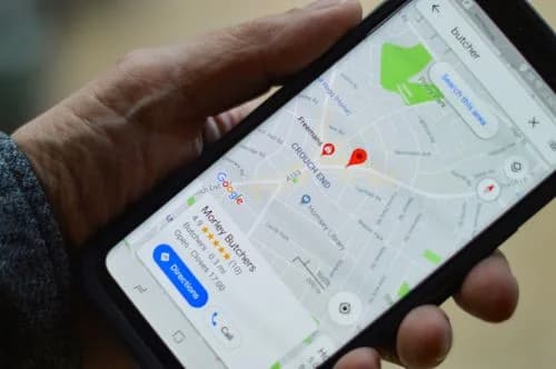
Our Complete Guide To Improving Your Google My Business Profile
In the world of local business marketing, your Google My Business profile isn't just another online listing, it's your digital shopfront that can make or break a potential customer's first impression.

Wordpress Websites Vs AI Websites
The decision between building a traditional WordPress website or embracing the new wave of AI-powered website builders has become one of the most significant choices facing businesses today. With Word...
What Is SEO And How Does It Work?
If you've ever wondered why some websites appear at the top of Google whilst others seem to vanish into the digital wilderness, you're asking the right question.